Graphing
If you are uploading your data to Emoncms.org or influxDB, there are a variety of ways to organize and view your voltage, power and energy use. The servers are fast and accessible from any place where there is internet connectivity. But there are some circumstances under which you may want to access your data locally:
You are not using Emoncms or influxDB to save your data.
You require finer resolution than is used in your Emoncms feeds.
You have output channels defined on your IotaWatt that are not replicated on Emoncms.
You want to post-process and view historic data using IotaWatt’s output channel feature.
The local graphing feature is derived from the Emoncms graphing application and adapted to report the input and output channels of IotaWatt directly. It is available on devices connected to the same WiFi network as the IotaWatt or on the internet using local port forwarding.
From the configuration app click  .
.
Press the Voltage, Power, and Energy tabs under Feeds to list your IotaWatt input and output channels. Select the Power tab and then select one or more of your channels listed there. Selecting Total_Power (actually an output channel that is the sum of Main_1 and Main_2) we get the following graph.

Notice that the graph covers a 24 hour period. That’s the default. You can select the period using the D, W, M, Y buttons at the top, and you can move the time frame left or right and zoom in or out.
Back to this graph. It reveals that average power is about 600 watts. To be precise, the mean power is 595 watts and the total power for the day was 14,300 watt-hours (14.3Kwh) as indicated in the feed statistics at the bottom. Wondering what might be causing those spikes at various times throughout the day? Lets lay some other input channels on top.
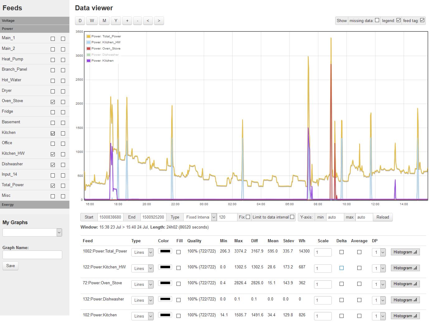
Now the story unfolds. Most of the 1000 watt spikes are cycles of a point-of-use electric water heater in the Kitchen (Kitche_HW). The big spike around 9pm is the Oven/Stove circuit, and the rest of the spikes seem to line up with kitchen appliances.
That’s just a sample of the power of the graphic presentation possible both locally and with essentially the same tool on Emoncms.org. Practically speaking, those power spikes are not the meat-and-potatoes of home energy use. Other circuits reveal the contribution of workhorse appliances like the refrigerator, freezer, heat-pump (not active this day), clothes dryer, computer and office machines. Kwh can be plotted as well, and compared to the whole. With 14 input channels, its possible to divide household usage into manageable components.